To build a city where it is impossible to build a city is madness in itself, but to build there one of the most elegant and grandest of cities is the madness of genius. - Alexander Herzen
Venice has for centuries been one of the most unique and fascinating cities in the world. I’ve lived near Venice for 24 years now and I’ve been there countless times, and with each time I fell in love all over again.
The citizens and the turists needs to however deal with the struggle of the High Water (‘Acqua alta’) phenomenon.
“High Water occurs when certain events coincide, such as:
- A very high tide (usually during a full or new moon).
- Low atmospheric pressure.
- A scirocco wind blowing up the narrow, shallow Adriatic Sea, which forces water into the Venetian Lagoon.
The phenomenon is most likely to take place between late September and April, and especially in the months of November, December, and october, in that order. However, thanks to global warming, it now can occur at any time of year.”
source: Europeforvisitors
What we are going to do today is discover if we can predict, using the hystorical metereological data, whether High Water will occurs and the expected sea level. The projects is structured as follows:
- Data scraping;
- Data analysis;
- Data pre-processing;
- Data visualization;
- Feature Engineering;
- Binary Classification problem;
- Regression problem.
I also want to state that all of the data used for this project is for educational purpose and it’s no-profit in any means, as stated in the Terms of use in the respective websites.
Data Scraping
There is no data science without data, so the first thing we have to do is to find our dataset. Both for excercise and because a good dataset was not available, I decided to scrape the metereological data from Weather Underground, which we can use for personal, non-commercial purposes. I won’t go over every little detail and line of code, but if you’re particularly interested you can find everything in my Github here. The libraries we’re going to use are requests and BeautifulSoup. While requests should come installed with Anaconda3, you can install BeautifulSoup typing
1
conda install -c anaconda beautifulsoup4
I strongly encourage you to look into the documentation when using those libraries if it’s your first time with them.
The idea is to access the content of a web page trough the requests API’s get() method. Then, we desire to parse the HTML to retrieve the table containing our data. However, the data in inside a table which gets rendered by the browser, so we can’t simply dig straight away into the HTML. Let’s start by installing the requests_html package. To install, simply write in your shell
1
pip install requests_html
After retrieving the page using an HTMLSession, we render the javascript code to obtain the complete HTML code. The code should be something like this:
1
2
3
4
5
6
7
8
9
10
11
12
13
14
# Retrieve a beautifoulsoup object with the HTML of the url)
def HTMLfromURL(url):
    # create an HTML asynchornous session
    session = HTMLSession()
    #use the session object to connect to the page
    page = session.get(url)
    # return the HTTP response code
    print('HTTP response: ' + str(page.status_code))   # 200: OK; 204: NO CONTENT
    # Run JavaScript code on webpage (sleep is for the loading time of the contents)
    page.html.render(sleep=4.5)

    # create a bs4 object over the html of the page
    soup = BeautifulSoup(page.html.html, 'html.parser')
    return soup
By inspecting the web page’s HTML, we locate our target data over the table with class ‘days ng-star-inserted’. After retrieving the table, we can easily access the headings and the body of our table. We can notice that there’s an inner table, so we locate the HTML and estract the data from the various rows. We also procees to split the multi-rows which contains ‘Max’, ‘Avg’ and ‘Min’ of various features, and we reallocate them as new features. I preferred to do this manually because extracting from the <td> ws a bit tricky for this table.
I won’t post the simple slicing function, but the overall code will be as follows:
1
2
3
4
5
6
7
8
9
10
11
12
13
14
15
16
17
18
19
20
21
22
23
24
25
26
def dataRetrieval(soup):
    #retrieve a bs4 object containing our table
    weather_table = soup.find('table', class_='days ng-star-inserted')
    #retrieve the headings of the table
    weather_table_head = weather_table.thead.find_all("tr")

    # Get all the headings
    headings = []
    for td in weather_table_head[0].find_all("td"):
        headings.append(td.text)
    #print(headings)


    ## retrieve the data from the table
    column, data = [], []
    weather_table_data = weather_table.tbody.find_all('table') # find inner tables
    for table in weather_table_data:
        weather_table_rows = table.find_all('tr') # find rows
        for row in weather_table_rows:
            column.append(row.text.strip()) #take data without spaces
        data.append(column)
        column = []

    # slice the triple rows into sub-wors
    datas = slicing(data, column, headings)
    return datas
Since every table store one month’s data, we’ll need lots of them. The more the better. We start from 1997 (the first weather data available on the site for venice) and go up to 2018 (this is due to the water level data which goes up to 2018). We proceed to store all of our data in a pandas DataFrame. This process can be automated as follows:
1
2
3
4
5
6
7
8
9
10
11
12
13
14
15
16
17
18
19
20
21
## double for - retrieve the various year's data
first = True
for year in range (1997, 2019):
    for month in range (1, 13):
        print('Retrieving weather data of '+str(month)+'/'+str(year))
        # URL of the page we want to retrieve
        url='https://www.wunderground.com/history/monthly/it/venice/date/'+str(year)+'-'+str(month)
        # Retrieve the HTML form the url
        soup = await asyncHTMLfromURL(url)
        # retrieve the data from the HTML
        fulldata = dataRetrieval(soup)
        # reformat the data section to be similar to the water level datas
        dataReformat(fulldata, year, month)
        dataframe = np.array([item[1:] for item in fulldata]).transpose()
        if first:
            df = pd.DataFrame(dataframe, columns=([item[0] for item in fulldata]))
            first = False
        else:
            df2 = pd.DataFrame(dataframe, columns=([item[0] for item in fulldata]))
            df = df.append(df2, ignore_index=True)
        print('weather data of '+str(month)+'/'+str(year)+' retrieved successfully!')
We also reformat the data in a more suitable way in the process. We can then save our dataframe so that we don’t actually have to download it every single time. I’m going to use a .CSV format which is pretty standard way to save a dataset.
We have successfully scraped our historical metereological data, but we are missing the key feature: the historical data for the water level in Venice. Luckily, we can find the data we need in the following page. We need however to download every .csv and rearrange them in a single dataset, which we’ll later join with the other dataset we’ve generated previously. We could do this manually, but let’s use some python magic to automate the procedure!
Once again to move around the various urls we can just change the year from the url, and trough the request.get() function we can download every .csv which we’ll then write on the disk. This is easily done by doing the following:
1
2
3
4
5
6
7
## from every url download and save on disk the .csv
for year in range (1997, 2019):
    url = 'https://www.comune.venezia.it/sites/comune.venezia.it/files/documenti/centro_maree/archivioDati/valoriorari_puntasalute_'+str(year)+'.csv'
    obj = requests.get(url)

    with open('./sea_level/'+str(year)+'_sea_levels.csv', 'wb') as file:
        file.write(obj.content)
Much quicker than doing it manually right? By checking our .csv, we discover that the data are arranged hourly for each day, while we only have one single weather value for every day. To play around this, we can extract the maximum, the minium and the average of the sea levels for each day. (Note that the 2015 files has some rows that contains plain text at the end that needs to be removed!) To load the csv we can use Pandas. Since the file use the ‘;’ as separator, we need to specify it (since pandas usually have ‘,’ as default).
The idea now is to cycle trough every year, extract the info we need for every set of days and re-arrange everything in a new dataset. The data column name change from 2016 onwards from ‘Data’ to ‘data’ and ‘GIORNO’, so keep that in mind while extracting the data. Using functions will make the code cleaner, so don’t just paste the same code over and over! Moreover, the year 2018 has metres as a metric, so we’ll adapt it to cm as the rest of the dataset. Since the code is a bit heavy, I won’t post it here, but you can find it as always on Github. Finally, we save our new dataset as a .csv once again.
Now that we have our datasets, we can load them and join them as a single dataset using the ‘day’ value.
Data analysis
We can inspect some rows of our dataset using the head() method of Pandas.
| Dates | Temperature (° F) Max | Temperature (° F) Avg | Temperature (° F) Min | Dew Point (° F) Max | Dew Point (° F) Avg | Dew Point (° F) Min | Humidity (%) Max | Humidity (%) Avg | Humidity (%) Min | Wind Speed (mph) Max | Wind Speed (mph) Avg | Wind Speed (mph) Min | Pressure (Hg) Max | Pressure (Hg) Avg | Pressure (Hg) Min | Precipitation (in) Total | min_sea_level (cm) | avg_sea_level (cm) | max_sea_level (cm) | |
|---|---|---|---|---|---|---|---|---|---|---|---|---|---|---|---|---|---|---|---|---|
| 0 | 01/01/1997 | 41 | 37.4 | 34 | 34 | 10.3 | 0 | 87 | 80.0 | 75 | 23 | 5.2 | 0 | 30.1 | 29.9 | 29.8 | 0.0 | 6.0 | 56.70 | 87.0 |
| 1 | 02/01/1997 | 39 | 37.2 | 34 | 36 | 31.2 | 0 | 87 | 84.0 | 81 | 13 | 4.5 | 0 | 30.1 | 30.0 | 29.9 | 0.0 | 16.0 | 41.58 | 82.0 |
| 2 | 03/01/1997 | 43 | 39.5 | 0 | 37 | 35.0 | 0 | 87 | 80.1 | 0 | 13 | 6.8 | 0 | 29.9 | 28.7 | 0.0 | 0.0 | 17.0 | 51.58 | 104.0 |
| 3 | 04/01/1997 | 45 | 40.7 | 36 | 41 | 35.2 | 0 | 100 | 84.4 | 81 | 17 | 6.1 | 0 | 29.6 | 29.6 | 29.5 | 0.0 | 19.0 | 62.75 | 120.0 |
| 4 | 05/01/1997 | 43 | 40.4 | 39 | 37 | 35.8 | 34 | 87 | 82.9 | 81 | 7 | 1.7 | 0 | 29.9 | 29.7 | 29.6 | 0.0 | -2.0 | 50.67 | 95.0 |
Let’s take a peek at our data finally. We have 20 columns in total. Let’s go over them quickly:
- Dates: This is the day where the measures takes place. It will surely be useful due to many information indirectly stored into it. As is its stored now it’s hard to use properly, so I’ll probably split the date into 3 columns: day, month and year.
- Temperature: This is a daily measure of the temperature in Fahrenit. To make up to the fact that we need to analyze an entire day, which involves many temperature changes, we use maximum, minimum and average temperature of each day.
- Dew Point: The dew point represents the temperature to which air must be cooled to in order to reach saturation (assuming air pressure and moisture content are constant). We consider the maximum, the minimum and the average.
- Humidity: Humidity is the amount of water vapor in the air. Usually on the report (as in our case) what is expressed is the so-called relative humidity, which is the amount of water vapor actually in the air, expressed as a percentage of the maximum amount of water vapor the air can hold at the same temperature. We consider the maximum, the minimum and the average.
- Wind Speed: This is the speed of the wind measured in metres per hour. We consider the maximum, the minimum and the average.
- Pressure: This represent the air pressure, which we can identify as “the force per unit of area exerted on the Earth’s surface by the weight of the air above the surface.” This is measured in inch of mercury (Hg). Once again, we consider the maximum, the minimum and the average.
- Precipitation: this represents the millimetres of rain that have fallen.
-
Sea level: This is the sea level registered at ‘Punta della salute’ in Venice. To help understand better this value, we defined the tide (considering measures in this particular place) as:
- Sustained if the sea level is between 80 and 109 cm above the sea;
- Strongly sustained if the sea level is between 110 and 139 cm above the sea;
- Exceptional high-water if the sea level is 140cm or more above the sea.
What we want to predict is whether or not there will be high-water, and the level that we’ll expect from the tide. Therefore, we’re in the scope of a supervised problem of binary classification and one of regression.
Since as a non-american I don’t really use Fahrenheit , I’ll convert temperatures to Celusius.
By inspecting our data with the info() Pandas method, we can see that we have 7938 non-null entries for the metereological data, and 7918 for the sea level. Moreover, all of our data have numerical values, minus the date.
We can also take a look at the summary of the numerical attribues by using the Pandas’s describe() method.
| Temperature (° C) Max | Temperature (° C) Avg | Temperature (° C) Min | Dew Point (° C) Max | Dew Point (° C) Avg | Dew Point (° C) Min | Humidity (%) Max | Humidity (%) Avg | Humidity (%) Min | Wind Speed (mph) Max | Wind Speed (mph) Avg | Wind Speed (mph) Min | Pressure (Hg) Max | Pressure (Hg) Avg | Pressure (Hg) Min | Precipitation (in) Total | min_sea_level (cm) | avg_sea_level (cm) | max_sea_level (cm) | |
|---|---|---|---|---|---|---|---|---|---|---|---|---|---|---|---|---|---|---|---|
| count | 7938.000000 | 7938.000000 | 7938.000000 | 7938.000000 | 7938.000000 | 7938.000000 | 7938.000000 | 7938.000000 | 7938.000000 | 7938.000000 | 7938.000000 | 7938.000000 | 7938.000000 | 7938.000000 | 7938.000000 | 7938.0 | 7918.000000 | 7918.000000 | 7918.000000 |
| mean | 17.708491 | 14.117109 | 9.306248 | 11.767070 | 8.685941 | 3.282313 | 90.485135 | 73.755455 | 52.875535 | 12.680146 | 5.879617 | 1.152683 | 30.049811 | 29.869337 | 29.091119 | 0.0 | -13.376358 | 29.813988 | 68.359939 |
| std | 8.482248 | 8.007571 | 8.569356 | 8.017119 | 8.281817 | 11.581388 | 9.413256 | 12.189284 | 19.048935 | 13.314916 | 3.193778 | 1.866562 | 1.145049 | 1.526021 | 4.923807 | 0.0 | 18.874075 | 13.261333 | 16.335222 |
| min | -2.000000 | -12.666667 | -17.000000 | -12.000000 | -16.611111 | -96.000000 | 44.000000 | 12.800000 | 0.000000 | 2.000000 | 0.200000 | 0.000000 | 0.000000 | 0.000000 | 0.000000 | 0.0 | -83.000000 | -14.000000 | 11.000000 |
| 25% | 11.000000 | 7.333333 | 3.000000 | 6.000000 | 2.902778 | -2.000000 | 87.000000 | 65.925000 | 43.000000 | 8.000000 | 3.800000 | 0.000000 | 29.900000 | 29.800000 | 29.800000 | 0.0 | -26.000000 | 21.710000 | 58.000000 |
| 50% | 17.000000 | 14.388889 | 10.000000 | 12.000000 | 9.777778 | 7.000000 | 93.000000 | 74.200000 | 53.000000 | 10.000000 | 5.400000 | 0.000000 | 30.100000 | 30.000000 | 29.900000 | 0.0 | -14.000000 | 29.120000 | 68.000000 |
| 75% | 25.000000 | 21.000000 | 17.000000 | 17.000000 | 15.555556 | 12.000000 | 100.000000 | 82.400000 | 65.000000 | 15.000000 | 7.300000 | 2.000000 | 30.200000 | 30.100000 | 30.100000 | 0.0 | -1.000000 | 36.867500 | 78.000000 |
| max | 92.000000 | 31.055556 | 27.000000 | 97.000000 | 25.555556 | 23.000000 | 100.000000 | 100.000000 | 100.000000 | 921.000000 | 33.100000 | 20.000000 | 56.800000 | 30.800000 | 30.600000 | 0.0 | 76.000000 | 103.710000 | 154.000000 |
count is the number of samples. mean is quite obviously the mean value fo the feature, while std represents the standard deviation. The percentiles rows shows the value below which a given percentage of observations in a group of observations fall.
We can notice easily some things from here, i.e unrealistic data like a maximum temperature of 92° or the fact that data relatives to the precipitation are just a series of zeros. We can see that the high-water happens only <25% of the grandtotal of days recorded. We can also make some assumptions over the statistical attributes of the data. For example, similiar mean and std let us assume for a standard distribution.
Data pre-processing
We can start by removing the precipitation column, since it’s clearly useless. On the chance that Precipitation might actually turn useful for our analysis, I found additional data over the National Oceanic and Atmospheric Administration (NOAA) website. We can load the dataset and join the table trough the data once again. This require some reformatting that is explained on the Notebook. In particular, we also have to do some data processing over our new feature. We can find the documentation of the data we’ve extracted here. In particular, we can see that for the precipitation feature a value of .00 indicates no measurable precipitation while 99.99 indicates missing values. There’s also a flag which express additional information regarding the measure which we don’t care about. We also use this chance to transform from inches to mm for more clarity.
It’s better to represent the dates by separing day, month and year, since we can imagine that some patterns or relations (like season cycles, which involves different meteorological phenomena) might be hidden in it. We can just drop the composed date afterwards since it’s redundant. I doubt that the ‘day’ column will prove useful, but we’ll keep it for now and eventually drop later on. The simple dates splitter function can be found on the Notebook.
We can create the binary column that determine whether or not a day will have high-water, which we can use as target for the binary classification and for studies later on, by using a binary flag set to 1 whenever the maximum level of high water for a day is over 80cm.
A good way to quickly analize feature’s correlation with one another is by pivoting them. This can help gain a lot of insight about previous assumptions over the data you had and create new ones. For example, we can see how the various months relates to high water phenomena.
1
df[['Month', 'High Water']].groupby(['Month'], as_index=True).mean().sort_values(by='High Water', ascending=False)
Running the previous line on our datasets outputs the following
| High Water | |
|---|---|
| Month | |
| 11 | 0.409091 |
| 10 | 0.287812 |
| 12 | 0.243759 |
| 1 | 0.197853 |
| 3 | 0.194190 |
| 9 | 0.189681 |
| 2 | 0.179153 |
| 4 | 0.177273 |
| 5 | 0.168622 |
| 6 | 0.134969 |
| 7 | 0.073206 |
| 8 | 0.063636 |
Looks pretty clear that during winter and spring, venice is more subjected to floodings. Guess splitting the date was useful after all. By doing the same operation but changing months with years, we can see that the occurance of the high water phenomena has increased substantially over the years. This is probably correlated to the climate crisis.
Data visualization
We should always try to visualize data whenever is possible. This helps us discover statistical relations, trends or anomalies on data. One quick way to take a peek at the data is to use the hist() method of pandas.
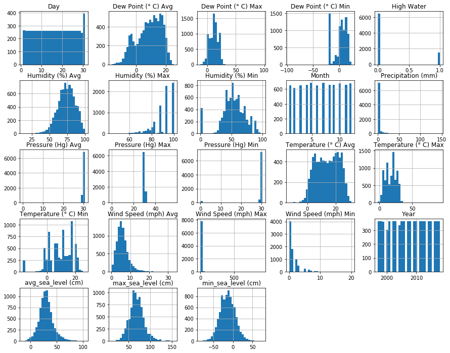
We can clearly see that some features has bell curve distribution, while others like the average wind speed or humidity are left or right skewed, which indicates that there are outliers in the data. Some histogram may appear clunky due to the fixed size for every histogram, so we’ll go later in detail for every feature.
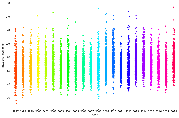
By plotting the maximum sea level over the years as a strip plot we can see how the sea level vary across the years.
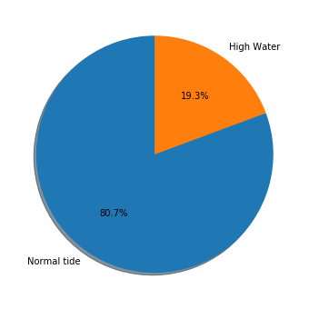
If we use a Pie chart we can quickly see that almost 21% of the days in venice features some form of flooding.
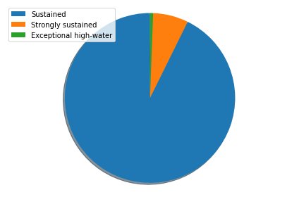
Out of those 20% of the days, the majority of it is just a sustained high water, (which luckily don’t afctually create any problem to the citzen of Venice). Only less than the 15% is strongly sustained or expectional. To check this, we create a temporary column from which we’ll count the different levels. We can then count the occurances and plot the Piechart.
Let’s check the precipitation.
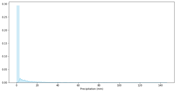
While the data might appear heavily skewed, we need to consider that in Venice only rain around 70 days over a full year, so this result is inflated by the 0 value. We can also try to use a scatter plot to search for some kind of relations between the precipitation and the level of the high water.
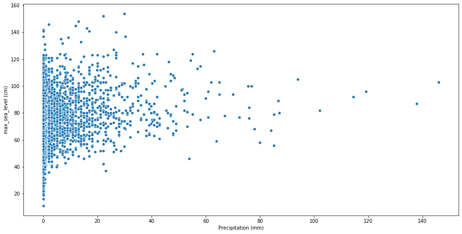
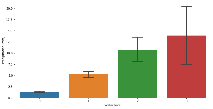
It doesn’t appear to be a direct relation between the water level and the precipitation, however by plotting the precipitation over the water level we can see that the high water phenomena occurs mostly whenever it rains more. A particular high error is however observed for the exceptional high water level.
Let’s switch our focus over the temperature data.
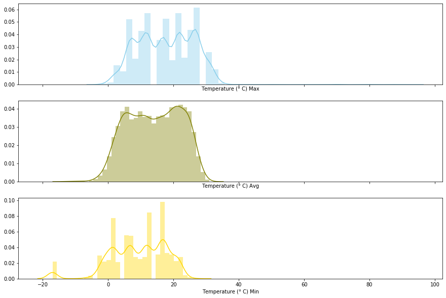
As we’ve saw previously, the data is positively skewed thus we can imagine the cause are outliers. One easy way to spot outliers in this situation is by plotting a boxplot considering the temperatures over the months.
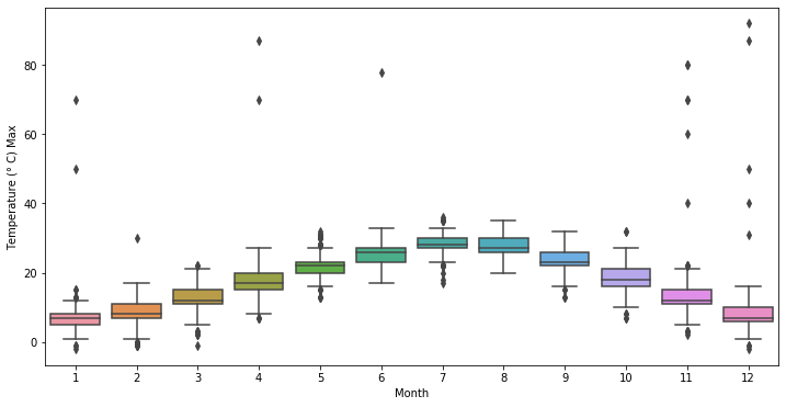
Seems pretty unreasonable to me that we could have over 40° in December, so it’s pretty safe to assume there must be some error or noise in the data which may hurt our prediciton. I’ll proceed by removing those data and using a null value as a placeholder.
On the other hand, plotting a Box Plot for the minimum temperatures shows that there an anomaly that shows each moth has an unreasonable temperature < 20°.
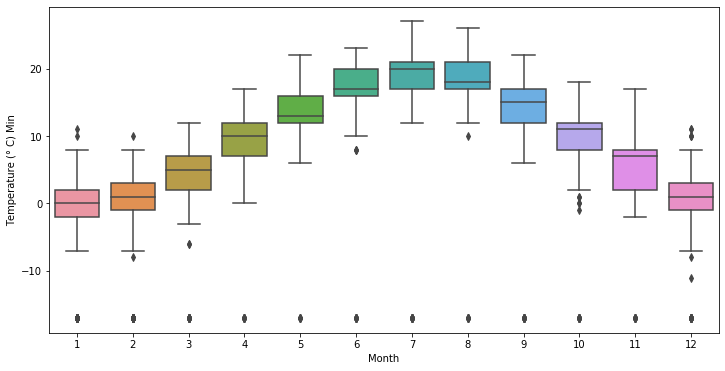
Clearly an error which we’ll patch for now by placing a null value as a placeholder once again.
Since the highest and the lowest temperature ever recorded for venice are 37° and -12°, I’ll use those as thresholds to cut-off the outliers.
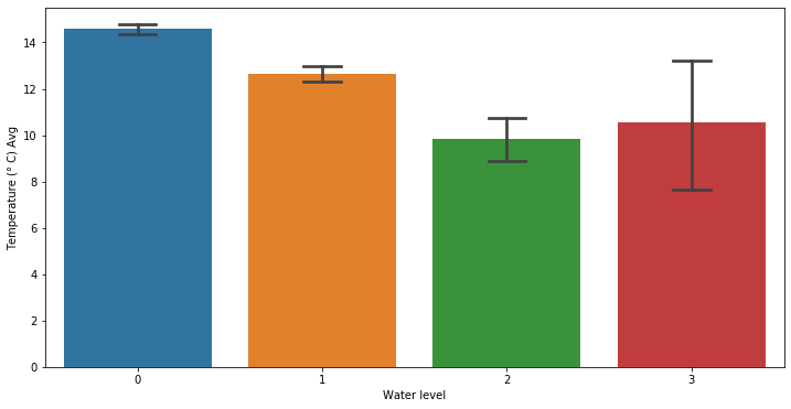
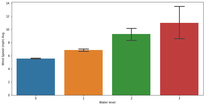
By taking a quick comparison between the temperature and the water level in Venice, we can see that heavier forms of floodings happens when the temperature is usually lower. This must be mostly correlated to seasons.
Wind speed is clearly skewed too. Wind speed is less than 30 (mph) in Venice. Therefore we can just cleanup the data whenever it surpass that threshold.
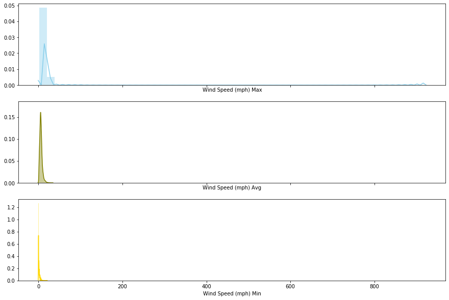
We can quickly see that high wind speed have an impact over the water tide as we may expect.
The pressure feature is centered around 30 but there is some outliers, which are obviously anomalies.
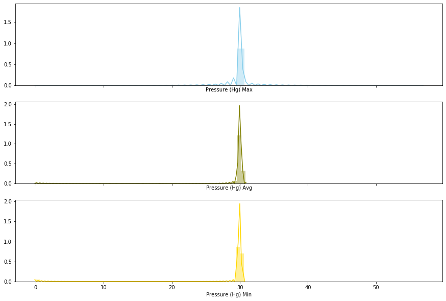
Let’s remove what is outside the [20, 40] range, once again based on historical data.
Regarding the dew point, this is just calculated using the temperature (hence the high Pearson correlation value) so we’re just going to drop it.
We can check the correlations between parameters trough a correlation heatmap. The correlations are calculated using Pearson’s r.
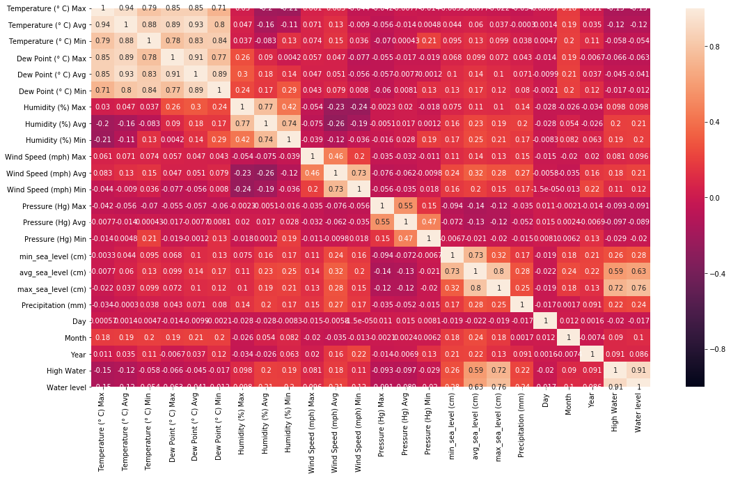
We can clearly see that some varaibles are less correlated to High Water, having small correlations, like the day or the Dew point.
We’re done with the data viz for now. Let’s play more with our data!
Feature engineering
We start by dropping the dew point variables and the Water level columns. Next, we can proceed to clean the outliers we’ve found with our previous analysis by substituting them with a null value placeholder.
We’ve set to none every value, but now we have to deal with those missing values. We can either delete the row, the entire column or fill the missing value with something new. We can take a look at the number of missing values for each feature by using
1
df.isnull().sum()
We see that some columns are missing a bit of values (around 200 for ‘Pressure (Hg) Min’ and ‘Temperature (° C) Min’, less for some other columns). In particular, we can just drop every row whereas the sea level is missing, since it’s our target label. Then, we can fill the missing values by using the median. In particular, due to high variablity of the data over the seasons, we’ll fill it with respect to the month. We can do this trough a restricted dataset generated trough a query.
1
2
3
4
5
6
7
8
9
10
11
12
13
14
15
16
17
18
# return the median w.r.t the month
def month_median(month, feature):
    df_month = df.query('Month == "'+str(month)+'"')
    month_median = df_month[feature].median()

    return month_median

def fill_NaN(dataset):
    clmn = list(dataset.head())
    for col in clmn:
        for j, row in dataset.iterrows():
            if math.isnan(row[col]):
                dataset.at[j, col] = month_median(int(row['Month']), col)


    return dataset

df = fill_NaN(df)
Now, we split our data into the data set X and the label set Y. We can split our data as Train, Validation and Test sets trough the train_test_split function of Sklearn. We’ll use the Training set to train our model and the validation set to evaluate its performace and tune it’s hyperparameters. Once we have choose our model, we’ll check its ability to generalize with unseen data trough the test set.
Now that we’ve processed our data, we can start train some models.
Binary Classification
For our binary classification analysis, we’ll try to predict whether or not High water will occur.
From what we’ve seen previously, the data was imbalanced, with a proportion of 4:1. This means that for example our model might get up to 80% accuracy just by always predict 0. This means that a naive algorithm that always flag “no High water” would obtain an decent accuracy without actually having learnt anything except the statistical property of our data (which is trivial with enough observation). Therefore we’ll evaluate our model using not only accuracy but also Precision and Recall.
To solve the imbalance issue, I also tried to oversample the class with the lowest amount of data (that is, the ‘1’). For doing this we use SMOTE(). Smote is a third party libraries which allows us to sample from a distribution generated from our data additional entries, to balance out our dataset.
1
2
3
4
5
from imblearn.over_sampling import SMOTE

smt = SMOTE()
# upsaple the dataset
X_train_up, Y_train_up = smt.fit_sample(X_train, Y_train["High Water"])
An overview of the differences in performance will appear more clear using a ROC curve later on. We’ll try different models to check what works better for us. To find the best hyperparameters I’ll use a GridSearch, which may take a long time depending on the hardware you’re running this on. I won’t report the code for every method since it’s the regular stuff. The models I tried are:
- Logistic Regression;
- Support Vector Machine (RBF Kernel);
- AdaBoost Classifier;
- Extra Trees Classifier;
- Random Forest Classifier
- Voting Classifier.
After I found the best hyperparameters, we can try to see the performance on the validation set. Since accuracy is a misleading metric, we consider ROC for choosing our classifier of choice. To plot the ROC curve we need the false positive rate and the true positive rate. To obtain this we can just use the roc_curve function from Sklearn. A way to compare classifier is then to evaluate their AUC (Area Under the Curve). The greater the area, the better the Precision/Recall values for the model.
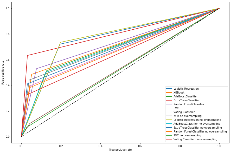
From our ROC we can choose the best model, where the dashed line in the middle is the expected curve for random guessing. We can see that support vector models are performing pretty badly, while the ones with the greates AUC are logistic regression models and the Extra Trees Classifier. We can measure their AUC trough the roc_auc_score function of Scikit Learn. The highest AUC are 0.76 for Extra Trees and Logistic regression. While they have similar score, we can clearly see from the plot that their precision and recall are quite different. A simple way to visualize the precision and recall is by using classification_report from Scikit learn. In particular, Extra trees has a Precision of 0.58 and a Recall of 0.63.
Due to the nature of our problem, we would prefer an higher precision due to the fact that false negative (predicting no high water while it happens) might create discomfort, while false positive are just a bother but don’t generate particular problems. We therefore choose the Extra Trees Classifier. We can finally evaluate our model on the test set.
We obtain around 88% accuracy on the test set, which is not too bad, however sadly the precision/recall values leave to be desired.
Let’s see if we obtain something better on the regression problem.
Regression
Let’s see if we can obtain a model that is able to predict the exact water level trough regression. We will try to predict the maximum water level value, since it’s the most informative one in our case. We’ll then evaluate the model trough the use of Mean Absolute Error and Root Mean Squared Error. The Mean Absolute Error is just the averaged difference between the forecasted value and the observed one. Mean absolute error is however not sensitive to outliers. The Root Mean Squared Error takes the square root of the Mean Squared Error, which is the averaged squared difference between forecasted value and the observed one. MSE & RMSE are useful when you want to see if the outliers are impacting our prediction, as it might be the case with the exceptional high water values.
Let’s start by creating a baseline naive model, which will tell us how well our model is performing with respect to a model which always predict the average of our target value.
1
2
3
4
5
6
Y_pred_naive = []

# Fill a vector with the mean value
for i in range (0, len(Y_val["max_sea_level (cm)"])):
    mean = Y_val["max_sea_level (cm)"].mean()
    Y_pred_naive.append(mean)
The naive model has a MAE 12.05 and a RMSE of 16.01. Now that we have our naive model we can try fitting some simple and more advanced models for regression. The other models i tried obtained score:
- Ridge regression: MAE=9.46, RMSE=12.04;
- Lasso regression: MAE=9.45, RMSE=12.03;
- Elastic Net: MAE=9.46, RMSE=12.04;
- XGBoost regression: MAE=8.63, RMSE=11.05.
We’ve found our best model in the eXtreme Gradient Boosting. Both the MAE and the RMSE have decreased by the naive model with decent scores. However, we can see that our model is a bit lacking in terms of predicting outliers (RMSE > MAE).
We can also use our regressor model to see how it performs on the binary classification problems by labelling the predictions. To do this, we predict the maximum level of High Water and then flag it as 1 for >80cm or 0 for <80cm. By doing this, we obtain a model with 83.4% accuracy, but with Precision 0.68 and Recall 0.50, which are a bit better than before.
We’ve managed to find a decent model for our data, which leave however margin for improvement. Using hourly values instead of daily might probably help our analysis, but sadly I was unable to find those for free online. The tides are also influenced by not only metereological effects but also from atmosferical effects. I skipped most of the code during this post, which you can find in my Github page. Overall, this was a good way to excercise for data scraping, data analysis and some machine learning. Hopefully you’ll find it useful and/or interesting. I’m always open for feedbacks!