I visualize what I do before I do it. Visualizing makes me better. - Clarence Clemons
I was doing some exercise with simple datasets founds on kaggle, but there was one thing was bugging me: I just wasn’t able to choose how to express my results in a meaningful way, both for me and an external reader. I’m sure this might be an issue for many others approaching data science for the first time, so I decided that this subjects could be a good piece of blog to write, both for me and (I hope!) for other person who might end up reading this article. Today we will focus on Data Visualization and some simple implementations on Python.
Data visualization is a key concepts when working with data. Be it understanding the correlation of two features or showing your boss how a certain product is selling, being able to use graphs efficiently is critical for a meaningful study of your data. Data visualization can be described as follows:
“Data visualization is the graphic representation of data. It involves producing images that communicate relationships among the represented data to viewers of the images. […] To communicate information clearly and efficiently, data visualization uses statistical graphics, plots, information graphics and other tools. […] Effective visualization helps users analyze and reason about data and evidence. It makes complex data more accessible, understandable and usable.” - source: Wikipedia
Data visualization has many application in fields like Data Science, Data Analyisis, Data Mining, and many more. Thankfully, there are many librearies out there that can help us in our task of deploying efficient and beautiful graphs. I’m going to implement some of the most basic and popular libraries for Data Visualization on Python, showing both how implement it and when you should do it.
Some of the most popular libraries on Data Visualization at the moment are:
- Pandas: This is the go-to library when managing data, and I’m sure most of you already know about it. Well, it turns out that Pandas also implements some (basic) way to visualize our data, which are built over Matplotlib;
- MatPlotLib: MatPlotLib is an easy to implement but hard to master library, due to lot of freedom given to the user. Matplotlib is designed to be as usable as MATLAB, with the ability to use Python, and the advantage of being free and open-source;
- Seaborn: Seaborn differs from MatPlotLib due to a more high-level interface and a more appealing appearance of the graph.
Over this post, we’re going to focus on those three libraries, but there are many others you can use, like Plotly, Bokeh or Ggplot. Feel free to try them out yourself and choose the one you find more comfortable with.
Installing the libraries
Let’s quickly go over the installation on your machine of the various libraries:
Pandas: The fastest way (and also my suggestion) is to install pandas is to install the Anaconda environment. This way, you will also install all the other components of SciPy like MatplotLib and Numpy. You can find all you need for installing Anaconda on your machine here. You can also install it singularly using Miniconda or PyPI. You can check more over this here.
MatplotLib: You can install it as a part of the Scipy stack with Anaconda (see above) or run the following comands on the shell/prompt:
1
2
python -m pip install -U pip
python -m pip install -U matplotlib
Seaborn: You can install the latest Seaborn version by running the following comands on the shell/prompt:
1
pip install seaborn
or you can install the released version using conda:
1
conda install seaborn
Loading the data
We can’t visualize data if we have no data, so let’s start by loading some dataset using Pandas. You can find many dataset on Kaggle or trough Google dataset search.
In particular, I’m going to use the World Happiness report 2019. We can load it using Pandas trough the read_csv() function. Let’s also import MatplotLib and Seaborn.
1
2
3
4
5
6
import pandas as pd
import matplotlib.pyplot as plt
import seaborn as sn

# Load the data
data = pd.read_csv('happiness.csv')
Let’s give a quick look to the structure of the dataset.
1
data.head()
| Country (region) | Ladder | SD of Ladder | Positive affect | Negative affect | Social support | Freedom | Corruption | Generosity | Log of GDP\nper capita | Healthy life\nexpectancy | |
|---|---|---|---|---|---|---|---|---|---|---|---|
| 0 | Finland | 1 | 4 | 41.0 | 10.0 | 2.0 | 5.0 | 4.0 | 47.0 | 22.0 | 27.0 |
| 1 | Denmark | 2 | 13 | 24.0 | 26.0 | 4.0 | 6.0 | 3.0 | 22.0 | 14.0 | 23.0 |
| 2 | Norway | 3 | 8 | 16.0 | 29.0 | 3.0 | 3.0 | 8.0 | 11.0 | 7.0 | 12.0 |
| 3 | Iceland | 4 | 9 | 3.0 | 3.0 | 1.0 | 7.0 | 45.0 | 3.0 | 15.0 | 13.0 |
| 4 | Netherlands | 5 | 1 | 12.0 | 25.0 | 15.0 | 19.0 | 12.0 | 7.0 | 12.0 | 18.0 |
Graph categories
There are many types of graphs, but we can mostly divide them in 4 basic categories, based on what we’re interested in visualizing:
You can use the hyperlinks to quickly navigate over the post. To choose the graph which suits best your needs, you need to think about things like the numbers of feature you want to display or the nature of your data.
We’ll go over all of the graph above, explaining more in detail when you should use it and how to plot it.
Relationship
One quick way to visualize the relationships of features is by graphing two (or more) related sets. In particular, when we’re working with two different features, one way to show the relation is the
Scatter plot
Scatter plots use points in the Cartesian plane to represent the values of real numbers. The dots not only shows the values of the points, but can also show interesting patterns in the data. Usually, on the X axis we project the intependent variable, while on the Y axis we project the dependent variable. Lines or curves may fit the data to better describe correlation and trends. You can find more about scatter plots here.
Let’s display a scatter plot in MatplotLib:
1
2
3
4
5
6
plt.figure(figsize=(10, 6))
plt.scatter(data['Healthy life\nexpectancy'], data['Ladder'])
plt.xlabel('Healthy life\nexpectancy')
plt.ylabel('Ladder')
plt.title('Corruption over ladder position')
plt.show()
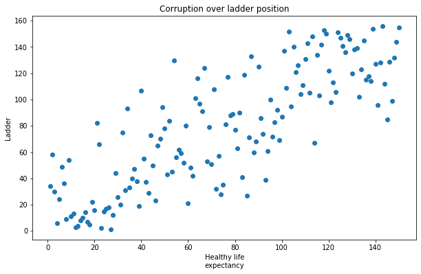
From the graph above, it’s easy to evince the two variables are correlated. You can instead display a Scatter plot using Seaborn like this:
1
2
plt.figure(figsize=(10, 6))
sn.scatterplot(x="Healthy life\nexpectancy", y="Ladder", data=data)
1
<matplotlib.axes._subplots.AxesSubplot at 0x23d6fdff4c8>
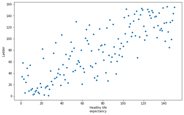
You can see how implementing a graph using Seaborn is much more High-level, but at the cost of many degrees of freedom.
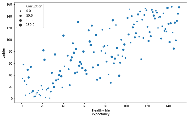
A way to show replationship between three variables consist in using
Bubble chart
Like Scatter Plot, Bubble charts use the cartesian plane to project two variables over the X and Y axes. However, Bubble charts express also a third variable trough the size of the circle. You can see Bubble charts a lot when understanding social, economical, medical, and other scientific relationships. You can find more about bubble charts here.
You can implement Bubble charts in MatplotLib like this:
1
2
3
4
5
6
# use the scatter function
plt.figure(figsize=(10, 6))
plt.scatter(data['Healthy life\nexpectancy'], data['Ladder'], data['Corruption'], alpha=0.6)
plt.xlabel('Healthy life\nexpectancy')
plt.ylabel('Ladder')
plt.show()

The graph is similar to what we’ve seen above, but now the size of the circles scale up with the Corrpution of the countries. The parameter $\alpha$ is used to set the proportional opacity of the circles.
1
2
plt.figure(figsize=(10, 6))
sn.scatterplot(x="Healthy life\nexpectancy", y="Ladder", size="Corruption",data=data)
1
<matplotlib.axes._subplots.AxesSubplot at 0x23d6e9b5b88>
Comparison
With Comparison Charts we aim at showing the difference (or similarity) between two or more variables. One main way to distinguish between comparison graphs is understanding if we want to analize data which changes over time, or static data.
In the static domain, we can show correlations between two variables and the data trough a
Variable Width Column chart
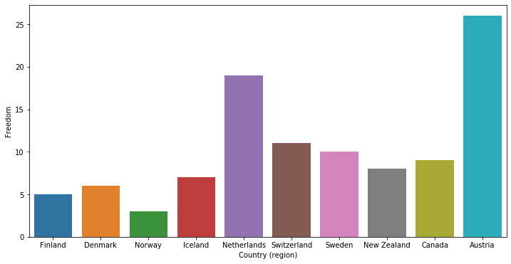
A column chart displays vertical bars going across the chart horizontally, with the values axis being displayed on the left side of the char. However, differently by a standard column chart, the width of the bars will vary for every category. For example, we can make the widths dependant on another parameter.
The implementation can get a bit tricky in python, but let’s go over it. To plot a column chart with variable widths in MatplotLib, we can use:
1
2
3
4
5
6
7
8
9
# Get scaled width for corruption
width = []
for i in range (0, 5): width.append(data["Corruption"][i]/35)

plt.figure(figsize=(10, 6))
plt.bar(data["Country (region)"][0:5], data["Freedom"][0:5], width=width)
plt.xlabel('Country')
plt.ylabel('Freedom')
plt.show()
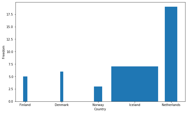
Where the width scale up with the Corruption of the country.
If we want instead to limit to one feature per item, we can use other kinds of graphs.
Bar Chart
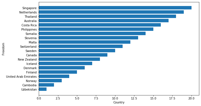
One of the most popular type of graph due to its simplicity, but an effective one nonetheless. A Bar chart is used to compare quantities, frequencies or values of different categories, which are placed on the Y axis of the cartesian plane. The X axis will shows instead the values of the selected features. Bar chart might be similar to column chart (and in a certain sense, that is the case). However, it’s usually better to use Horizontal Bar Charts when graphing nominal variables, and instead prefer column charts for ordinal variables. Due to the nature of bar charts it’s also preferred to use it when you have a lot of different categories, and prefer the Column chart when you have a reduced number of different categories you desire to plot. You can find more about bar chart here.
Let’s quickly implement a bar chart in MatplotLib trough the barh() function:
1
2
3
4
5
6
7
8
# sort data by freedom
data_sorted = data.sort_values('Freedom')

plt.figure(figsize=(10, 6))
plt.barh(data_sorted["Country (region)"][0:20], data_sorted["Freedom"][0:20])
plt.xlabel('Country')
plt.ylabel('Freedom')
plt.show()
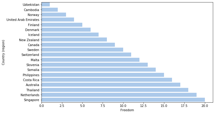
With Seaborn, the implementation is simply
1
2
3
4
# Plot the total crashes
plt.figure(figsize=(10, 6))
sn.barplot(x="Freedom", y="Country (region)", data=data_sorted[0:20],
             color="b")
1
<matplotlib.axes._subplots.AxesSubplot at 0x23d701ab148>
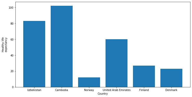
Column Chart
Column Charts are mostly the same of Bar charts, just with inverted axes. It’s usually better to use Column charts with a small number of categories. The imlplementation is straightforward:
1
2
3
4
5
plt.figure(figsize=(12, 6))
plt.bar(data_sorted["Country (region)"][0:6], data_sorted["Healthy life\nexpectancy"][0:6])
plt.xlabel('Country')
plt.ylabel('Healthy life\nexpectancy')
plt.show()
The code for the Seaborn implementation is:
1
2
plt.figure(figsize=(12, 6))
sn.barplot(x="Country (region)", y="Freedom", data=data[0:10])
1
<matplotlib.axes._subplots.AxesSubplot at 0x23d715d4b88>
Sometimes we just want to see how data changes over time. For example, how the PIL of a certain nation will vary over the years, or how many times you went to eat over a month. Since there’s no data suitable for some example if our first dataset, let’s start by importing a second dataset, this time with the Russian demography between 1990 and 2017.
1
2
3
4
# Load the data
russian = pd.read_csv('russian_demography.csv')

russian.head()
| year | region | npg | birth_rate | death_rate | gdw | urbanization | |
|---|---|---|---|---|---|---|---|
| 0 | 1990 | Republic of Adygea | 1.9 | 14.2 | 12.3 | 84.66 | 52.42 |
| 1 | 1990 | Altai Krai | 1.8 | 12.9 | 11.1 | 80.24 | 58.07 |
| 2 | 1990 | Amur Oblast | 7.6 | 16.2 | 8.6 | 69.55 | 68.37 |
| 3 | 1990 | Arkhangelsk Oblast | 3.7 | 13.5 | 9.8 | 73.26 | 73.63 |
| 4 | 1990 | Astrakhan Oblast | 4.7 | 15.1 | 10.4 | 77.05 | 68.01 |
This will be our “time-based” dataset from now on. Let’s now return over our comparison graph, in particular
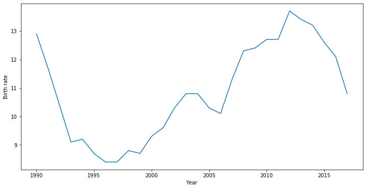
Line Chart
A line chart is a very simple graph, which shows how our variable evolve trough time. On the X axis, we’ll use our time scale (be it days, years, etc), while on the Y axis we’ll put the dependent variable. Line Graphs are mostly used to show trends or analyse how the data evolve trough time. You can find more about line chart here.
A simple implementation in MatplotLib is
1
2
3
4
5
6
7
8
# get the restricted dataset where "Region"="Altai Krai"
reduced_russian = russian.query('region == "Altai Krai"')

plt.figure(figsize=(12, 6))
plt.plot(reduced_russian["year"], reduced_russian["birth_rate"])
plt.xlabel('Year')
plt.ylabel('Birth rate')
plt.show()
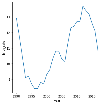
In Seaborn, you can just simply use the following function:
1
2
plt.figure(figsize=(12, 6))
sn.relplot(x="year", y="birth_rate", kind="line", data=reduced_russian)
1
2
3
4
5
6
<seaborn.axisgrid.FacetGrid at 0x23d73cea3c8>


<Figure size 864x432 with 0 Axes>
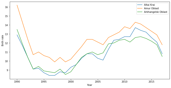
It’s a pretty straightforward kind of graph so I expect you to grasp how to use it efficiently right away. If we move our attention over a smaller time period (like 3 years out of the 27 in our russian dataset) and wan to take nto account a small set of variables, we can once again use Column chart. If we want instead to focus over many categories, we can use a line chart with different lines for every category we’re interested in.
1
2
3
4
5
6
7
8
9
10
reduced_russian_2 = russian.query('region == "Amur Oblast"')
reduced_russian_3 = russian.query('region == "Arkhangelsk Oblast"')
plt.figure(figsize=(12, 6))
plt.plot(reduced_russian["year"], reduced_russian["birth_rate"])
plt.plot(reduced_russian_2["year"], reduced_russian_2["birth_rate"])
plt.plot(reduced_russian_3["year"], reduced_russian_3["birth_rate"])
plt.legend(['Altai Krai', 'Amur Oblast', 'Arkhangelsk Oblast'])
plt.xlabel('Year')
plt.ylabel('Birth rate')
plt.show()
Let’s focus now on the topic of
Distribution
Something always worth exploring is the distribution of the data, which gives us insight on how many time a certain data occurs, their normal tendecy or the range where the information span. Data might not always assume a Normal distribution, but usually data that follow some probability distribution is valuable.
When we want to focus on a specific variable distribution, we can use
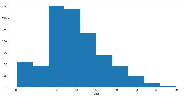
Histogram and Line Histogram
Histograms gives a good overview about the distribution of the data. Each bar in a histogram represents the tabulated frequency at each interval. It differs from a bar chart, where you consider the correlation between two variables. From histograms, you can evince immediatly if the data are following some kind of probability distribution, if the data is sweked (either right or left), or if it is bimodal or multimodal. You can read more about histograms here.
Let’s briefly consider the Titanic dataset from Kaggle, and let’s do some pre-processing for features we’ll need later on.
1
2
3
4
5
6
7
8
9
10
11
12
13
14
15
# Load the data
titanic = pd.read_csv('train.csv')

# convert to binary ints
def NumSex(data):
    data.Sex = data.Sex.replace('female','0')
    data.Sex = data.Sex.replace('male','1')
    data.Sex = data.Sex.astype(int)

NumSex(titanic)

age_median = titanic['Age'].median() # calculate the age median
titanic['Age'].fillna(age_median, inplace=True) # Replace the NaN values with median

titanic.head()
| PassengerId | Survived | Pclass | Name | Sex | Age | SibSp | Parch | Ticket | Fare | Cabin | Embarked | |
|---|---|---|---|---|---|---|---|---|---|---|---|---|
| 0 | 1 | 0 | 3 | Braund, Mr. Owen Harris | 1 | 22.0 | 1 | 0 | A/5 21171 | 7.2500 | NaN | S |
| 1 | 2 | 1 | 1 | Cumings, Mrs. John Bradley (Florence Briggs Th... | 0 | 38.0 | 1 | 0 | PC 17599 | 71.2833 | C85 | C |
| 2 | 3 | 1 | 3 | Heikkinen, Miss. Laina | 0 | 26.0 | 0 | 0 | STON/O2. 3101282 | 7.9250 | NaN | S |
| 3 | 4 | 1 | 1 | Futrelle, Mrs. Jacques Heath (Lily May Peel) | 0 | 35.0 | 1 | 0 | 113803 | 53.1000 | C123 | S |
| 4 | 5 | 0 | 3 | Allen, Mr. William Henry | 1 | 35.0 | 0 | 0 | 373450 | 8.0500 | NaN | S |
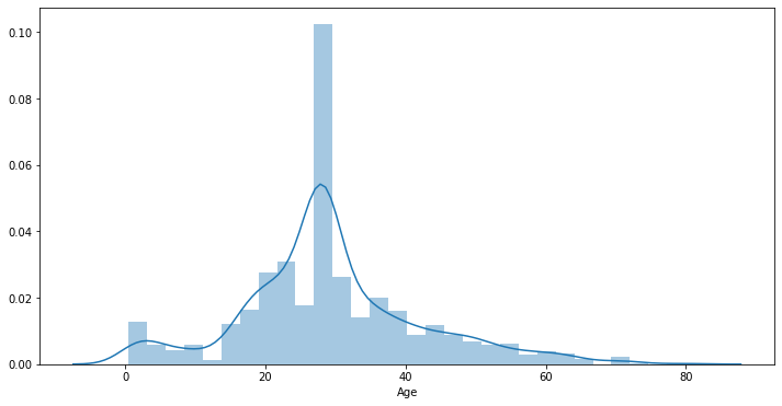
And ket’s plot the histogram over the age of the survivor:
1
2
3
4
plt.figure(figsize=(12, 6))
plt.hist(titanic["Age"])
plt.xlabel('Age')
plt.show()
With Seaborn we can use the distplot() function. By default distplot() will provide both the histogram and fit a *Kernel density estimate *.
In statistics, kernel density estimation (KDE) is a non-parametric way to estimate the probability density function of a random variable. - Wikipedia
1
2
plt.figure(figsize=(12, 6))
sn.distplot(titanic["Age"])
1
<matplotlib.axes._subplots.AxesSubplot at 0x23d72eb5dc8>
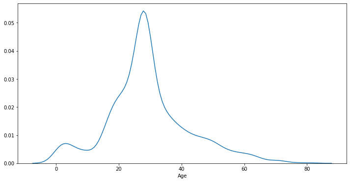
It’s also possible to plot only the fit by choosing hist=False over the distplot function in Seaborn.
1
2
plt.figure(figsize=(12, 6))
sn.distplot(titanic["Age"], hist=False)
1
<matplotlib.axes._subplots.AxesSubplot at 0x23d7389d648>
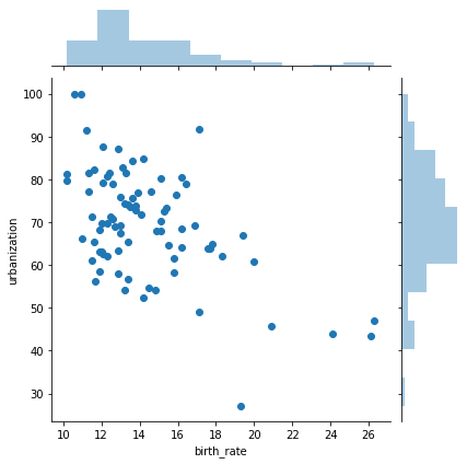
When we want to study the distribution over two variables, we can use once again the
Scatter plot
We’ve already talked about scatter plot, and here it works in the same way. Something interesting for displaying even more clearly the distribution is using jointplot() in Seaborn, which plot both the scatterplots and the relative histograms for the variables.
1
2
3
reduced_russian = russian.query('year == 1990')
plt.figure(figsize=(12, 6))
sn.jointplot(x="birth_rate", y="urbanization", data=reduced_russian)
1
2
3
4
5
6
<seaborn.axisgrid.JointGrid at 0x23d758afdc8>


<Figure size 864x432 with 0 Axes>
Let’s not switch our focus over
Composition
Composition shows what particular feature are present on the data, and how they change over time. One of the most easy to read and popular comparison chart for statical data is
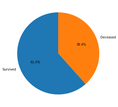
Pie chart
Pie charts divide a circe in different proportional segments. Each arc’s length represents the proportion of each category with respect to the total data. You can read more about pie charts here.
Let’s see an example in MatplotLib:
1
2
3
4
5
surv, ded = titanic['Survived'].value_counts() # count occurencies

plt.figure(figsize=(12, 6))
plt.pie([surv, ded],  labels=['Survived','Deceased'], autopct='%1.1f%%',  shadow=False, startangle=90)
plt.show()
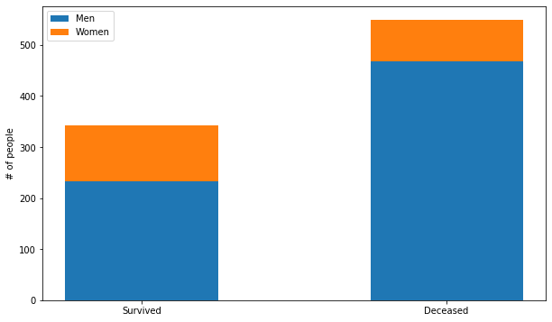
Stacked column chart
Stacked column charts differs from the classic column charts by stacking over each bar multiple data over each other. This can shows both how a group is divided and give a good insight over its proportionality. In particular, we differentiate Simple Stacked Bar Graphs, where we just stack the values, and 100% Stack Bar Graphs which shows the percentage with respect to the whole of each group.
Let’s implement a stacked column chart in MatplotLib:
1
2
3
4
5
6
7
8
9
10
11
12
13
14
15
16
17
18
# get the restricted datasets
titanic_survived = titanic.query('Survived == 1')
titanic_deceased = titanic.query('Survived == 0')

men_surv, women_surv = titanic_survived['Sex'].value_counts() # count occurencies
men_ded, women_ded = titanic_deceased['Sex'].value_counts() # count occurencies
ind = np.arange(2)

# Plots bar
plt.figure(figsize=(10, 6))
p1 = plt.bar(ind, [men_surv, men_ded], 0.5)
p2 = plt.bar(ind, [women_surv, women_ded], 0.5, bottom=[men_surv, men_ded])


plt.ylabel('# of people')
plt.xticks(ind, ('Survived', 'Deceased'))
plt.legend((p1[0], p2[0]), ('Men', 'Women'))
plt.show()
If you want to showcase difference between different periods, one good way to show this is trough
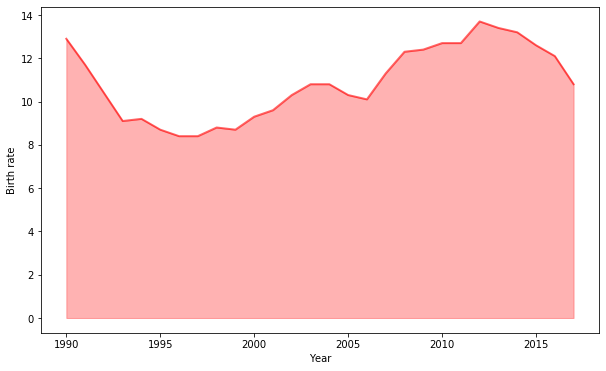
Area charts and stacked area charts
Area charts are similar to a line chart, but here the space (which is the area) below the line is filled with some colour or texture. Area charts are used to represent cumulated totals using numbers or percentages over time.
Let’s go back to our russian demography dataset and check an implementation of area chart in MatplotLib:
1
2
3
4
5
6
7
8
9
# get the restricted dataset where "Region"="Altai Krai"
reduced_russian = russian.query('region == "Altai Krai"')

plt.figure(figsize=(10, 6))
plt.fill_between(reduced_russian["year"], reduced_russian["birth_rate"], color="red", alpha=0.3) # Fill the area
plt.plot(reduced_russian["year"], reduced_russian["birth_rate"], color="red", alpha=0.6, linewidth=2) # Plot the line
plt.xlabel('Year')
plt.ylabel('Birth rate')
plt.show()
To compare different trends, you can plot multiple areas in the same graph:
1
2
3
4
5
6
7
8
9
10
11
12
13
14
15
16
17
18
19
# get the restricted datasets
reduced_russian = russian.query('region == "Altai Krai"')
reduced_russian_2 = russian.query('region == "Amur Oblast"')
reduced_russian_3 = russian.query('region == "Arkhangelsk Oblast"')

plt.figure(figsize=(10, 6))
plt.fill_between(reduced_russian["year"], reduced_russian["birth_rate"], color="green", alpha=0.3, label='Altai Krai') # Fill the area
plt.plot(reduced_russian["year"], reduced_russian["birth_rate"], color="green", alpha=0.6, linewidth=2) # Plot the line

plt.fill_between(reduced_russian_2["year"], reduced_russian_2["birth_rate"], color="skyblue", alpha=0.3, label='Amur Oblast') # Fill the area
plt.plot(reduced_russian_2["year"], reduced_russian_2["birth_rate"], color="skyblue", alpha=0.6, linewidth=2) # Plot the line

plt.fill_between(reduced_russian_3["year"], reduced_russian_3["birth_rate"], color="blue", alpha=0.3, label='Arkhangelsk Oblast') # Fill the area
plt.plot(reduced_russian_3["year"], reduced_russian_3["birth_rate"], color="blue", alpha=0.6, linewidth=2) # Plot the line

plt.xlabel('Year')
plt.ylabel('Birth rate')
plt.legend()
plt.show()
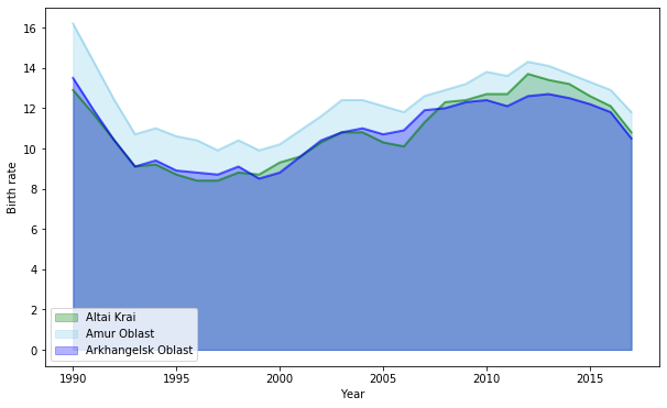
Or implement a stacked area graph. A stacked area chart is what you obtain by plotting together multiple area charts. Those are best used when you want to visualize relationships of groups as a whole, helping show how each group contributes to the grandtotal.
Those are most of the basic graphs you’ll encounter during your analysis, but there are many more (advanced and not) that might be useful to you: Violin plots, Marimekko charts, Gantt, heatmaps, etcetera. Hopefully you’ll find this guide useful. I strongly encourage you to go deeper in data visualization if you are interested in the topic, since this is but a first approach to data visualization in Python.
sources
“Chart Chooser”, by Andrew V. Abela